For my music video I decided early on what I wanted my video to look like and come across to the audience. My music video automatically fell into the forms and conventions of a general country music video. Even though some things remain different. A few non-country music artists inspired me into my ideas, especially when it came to having the artist and the story-line and colour difference between scenes.
Katy Perry's video shows similar emotions due to losing a loved one. This is expressed due to the words she is singing and the emotions shown by the character throughout.
My music video has a strong story line from beginning to end. Although set in a number of different locations, I wanted to encourage the outside, nature and general country look and feel to the video. Also my artist was in the video both singing and acting. These are all typical aspects of a country video that I have incorporated into my video.
Throughout the video the scenes switch between the artist who is singing the story and the actor who is role playing. These scenes can be distinguished due to the effects added, the deliberate difference in clothes and the different locations as the singer stays at the same location throughout the whole of the video whereas the acting is staged at two different locations.
Camerawork
For me, camerawork was a very important aspect to the production of my music video, especially when it came to the role playing side of the video. It could help indicate the feelings and emotions of the character, the location and generally make the video a lot more interesting. Among trying to get the feelings of the character across I tried to use as many angles and shots as possible to make this video interesting for the audience. I also used the camerawork to signify important objects as well as character feelings. I used the close-up shot to help do this.
Editing
This also played a major part in my video. At the beginning of the video I opened it with a title sequence as there is a long intro too the song. This worked well with the panning shot to the right to introduce the artist to the audience. I used technical codes such as colour correction to help distinguish the difference between the scenes. So, the scenes with the singer were a rich and warm colour. This fitted in with the country theme. The role play scenes were totally different as I wanted a sad, lonely and cold feel to come across to the audience. In order to create this effect I changed the colour correction and played around with the saturation, exposure and hue. The end result was a more blue/purple tint. The transitions were quick cuts to help flow the scenes together and I feel this works successfully.
Due to this being a music video I did not incorporate any other sound apart from the music. I muted all the scenes as there was no sound effect needed like there is sometimes used in other videos.
These photos are from Avril Lavigne's video 'Nobodys Home' that helped inspire my idea of different effects on the scenes where the singer is telling the story and the character role playing it. Although the story line is different to my video it is very similar in emotions, the distinguishing of the singer and the character as being two different people although played by the same person, the different colour effects on the footage and the using of a number of different locations.
This video was a major part in my planning as produced strong emotion which is what I was working towards when creating my video.
Mise en scene
There is one symbolic code that I used within my video. This was inspired by Katy Perry's 'Thinking of you' video. The song is about losing someone and this photo shows who it is. The fact that there is a stage where the camera is just looking at the photo signifies how important this person was/is to the character. This shows how critical this prop is in the video. Clothing was also important. Because there were two different sides in the music video I had to make the decision of what would work better. I chose to keep darker and more casual clothes for the role-playing scenes and brighter more fashionable clothes for the music artist. This way both could easily be distinguished and the mood of the character and singer would be more represented to the audience.
Katy Perry's 'Thinking of you' inspired my scene in my video.
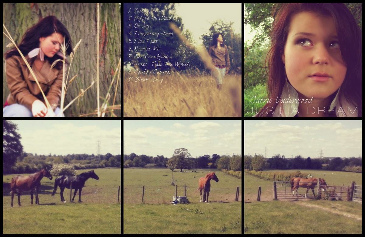
When creating my ancillary tasks I ensured that I kept to the country dream like theme.
My two ancillary tasks show consistency throughout. There is continuity in the fonts, lighting and location. More specifically I kept continuity in the music artist; what clothes she's wearing, hair style and make-up.
Both these texts give off the same warm country feel that I wanted to create. The fonts are the same so that if either these are seen by a consumer, they will link together and will help to relate to the artist. One of the fonts is in a handwriting type font to signify the country and natural look. Whereas the title of the album is big, bold and although simple, stands out to the consumer. The name of the artist and CD name is also laid out the same way to help link everything together. The fact both the ancillary tasks are done with a more simple design, creating a less 'busy' attitude works quite successfully. It is enough to attract attention and give need to know information and not turn people away as there is so much writing. The continuity of the clothing and location is also carried on into my main task. All of my photography was done at the same location. My music video shows two sides of the music artist with the role-playing and the actual singing scenes. This is hidden from the audience at this point in the ancillary tasks which I think makes it better as there is more of a surprise for the audience when they watch the music video which will then create a more interesting text. It also means that I am not giving too much away to the audience.
There are also a number of things that I have kept the same in my music video. The clothing of the music artist is the same, one of the locations are the same. However, rather than sticking to the same location all the way through I have filmed at two others to help make my 5 minute video more interesting. This is also why I added the role playing, keeping that separate from the singing scenes to help create different atmospheres and emotions for the audience. I also thought it would be more effective on the audience as it is heartfelt and many people have lost loved ones so can relate.
Synergy has been used throughout. Because the video links so closely with the ancillary tasks it will sell more copies. The video is mainly promotional so this would work well with the digipak and magazine advertisement because they match and from audience feedback, tells me that they work well together.
This is my final magazine advertisng poster. I wanted a simple look to go with the style of the Digipak so that there was consistency in both Preliminary tasks. Although the image is quite different compared to the Digipak images I am pleased with this as it does give the dream like effect I want it to have. The fonts are consistant which works successfully to link the products together. I also find this image is a lot more conventional with the country theme as surrounded by nature and the colour scheme works.
Friday, 17 January 2014
This is the original layered image that I designed but I felt the artist was too drowned out so I have made her appear stronger in this image, I feel this works too, although does create a darker image.