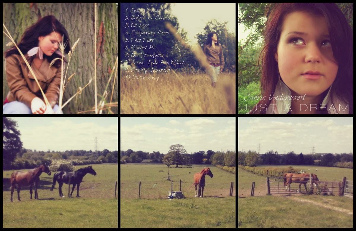
When creating my ancillary tasks I ensured that I kept to the country dream like theme.
My two ancillary tasks show consistency throughout. There is continuity in the fonts, lighting and location. More specifically I kept continuity in the music artist; what clothes she's wearing, hair style and make-up.

Both these texts give off the same warm country feel that I wanted to create. The fonts are the same so that if either these are seen by a consumer, they will link together and will help to relate to the artist. One of the fonts is in a handwriting type font to signify the country and natural look. Whereas the title of the album is big, bold and although simple, stands out to the consumer. The name of the artist and CD name is also laid out the same way to help link everything together. The fact both the ancillary tasks are done with a more simple design, creating a less 'busy' attitude works quite successfully. It is enough to attract attention and give need to know information and not turn people away as there is so much writing. The continuity of the clothing and location is also carried on into my main task. All of my photography was done at the same location. My music video shows two sides of the music artist with the role-playing and the actual singing scenes. This is hidden from the audience at this point in the ancillary tasks which I think makes it better as there is more of a surprise for the audience when they watch the music video which will then create a more interesting text. It also means that I am not giving too much away to the audience.
There are also a number of things that I have kept the same in my music video. The clothing of the music artist is the same, one of the locations are the same. However, rather than sticking to the same location all the way through I have filmed at two others to help make my 5 minute video more interesting. This is also why I added the role playing, keeping that separate from the singing scenes to help create different atmospheres and emotions for the audience. I also thought it would be more effective on the audience as it is heartfelt and many people have lost loved ones so can relate.
Synergy has been used throughout. Because the video links so closely with the ancillary tasks it will sell more copies. The video is mainly promotional so this would work well with the digipak and magazine advertisement because they match and from audience feedback, tells me that they work well together.


No comments:
Post a Comment